
| 일 | 월 | 화 | 수 | 목 | 금 | 토 |
|---|---|---|---|---|---|---|
| 1 | 2 | 3 | ||||
| 4 | 5 | 6 | 7 | 8 | 9 | 10 |
| 11 | 12 | 13 | 14 | 15 | 16 | 17 |
| 18 | 19 | 20 | 21 | 22 | 23 | 24 |
| 25 | 26 | 27 | 28 | 29 | 30 | 31 |
- ADSP
- machinelearning
- 공빅
- 2023공공빅데이터청년인재양성
- Keras
- textmining
- DeepLearning
- NLP
- 데이터전처리
- 2023공공빅데이터청년인재양성후기
- ADsP3과목
- 공공빅데이터청년인재양성
- 분석변수처리
- 클러스터링
- 공빅데
- Kaggle
- 공공빅데이터청년인턴
- datascience
- 2023공빅데
- 오버샘플링
- k-means
- 머신러닝
- 텍스트마이닝
- 데이터분석
- DL
- ML
- 빅데이터
- SQL
- decisiontree
- data
- Today
- Total
愛林
[Python/Data Analysis] ARIMA - Aerial Bombing Operations in World War II, Weather Conditions in World War II 데이터를 이용한 시계열분석 본문
[Python/Data Analysis] ARIMA - Aerial Bombing Operations in World War II, Weather Conditions in World War II 데이터를 이용한 시계열분석
愛林 2022. 7. 31. 21:51
이전에 알아보았던 ARIMA 시계열 분석법을 실습해보자.
Time Series Prediction Tutorial with EDA Python
Aerial Bombing Operations in World War II, Weather Conditions in World War Two
ARIMA 실습
kaggle 에서 2차 세계대전 날씨 데이터 (https://www.kaggle.com/datasets/smid80/weatherww2 ) 를 가져왔으며,
https://www.kaggle.com/code/kanncaa1/time-series-prediction-tutorial-with-eda 코드를 참조했다고 한다.
나는 블로그 참조 ^~~^
jupyter Notebook 환경에서 실습했다.
이 데이터에서는 Aerial Bombing Operation (공중폭격작전) 과 Weather Conditions in World War II (2차 세계대전 날씨)
데이터를 사용했다. 이 데이터에서 세계 2차대전은 WW2 로 칭했다.
Aerial Bombing Operations in WW2 는 폭격 작전을 포함하는 데이터인데, 예를 들어 1945년 A36 항공기로
독일 폰테올리보 비행장 폭탄을 사용한 미국 데이터도 포함한다.
Weather Conditions in WW2 는 2차 세계대전 동안의 날씨 데이터이다.
이 데이터에는 2개의 하위 집합을 포함하는데, 첫 번째는 국가, 위도, 경도와 같은 기상 관측소 위치,
두 번째는 기상 관측소에서 측정한 최소, 최대 및 평균 온도이다.
먼저, 필요한 라이브러리를 불러와주자.
import numpy as np # linear algebra
import pandas as pd # data processing, CSV file I/O (e.g. pd.read_csv)
import seaborn as sns # visualization library
import matplotlib.pyplot as plt # visualization library
from chart_studio import plotly as py #visualization library
from plotly.offline import init_notebook_mode, iplot # plotly offline mode
init_notebook_mode(connected=True)
import plotly.graph_objs as go # plotly graphical object
import os
# import warnings library
import warnings
# ignore filters
warnings.filterwarnings("ignore") # if there is a warning after some codes, this will avoid us to see them.
plt.style.use('ggplot') # style of plots. ggplot is one of the most used style, I also like it.
# Any results you write to the current directory are saved as output.
우린 분석에 필요한 칼럼만 불러올 것이다.
불러온 후, 불러온 데이터들을 확인해주자.
# 분석에 필요한 칼럼만 불러오기

weather_station_location = pd.read_csv('./Weather Station Locations.csv')
weather = pd.read_csv('./Summary of Weather.csv')
weather_station_location = weather_station_location.loc[:,["WBAN", "NAME",
                            "STATE/COUNTRY ID", "Latitude", "Longitude"]]
weather = weather.loc[:,["STA", "Date", "MeanTemp"]]
weather_station_location.head()
- WBAN: 기상청 번호
- NAME: 기상 관측소 이름
- STATE/COUNTRY ID: 국가의 약자
- Latitude: 기상 관측소의 위도
- Longitude: 기상대의 경도
weather.head()
- STA: 어느 역 번호 (WBAN) (네이버 어휘사전)
- Date: 온도측정일자
- MeanTemp: 평균 온도
여러 지역들 중, BINDUKURI 지역에 대한 일 평균 온도를 대상으로 분석을 진행했다.
weather_station_id = weather_station_location[weather_station_location.NAME == 'BINDUKURI'].WBAN
weather_bin = weather[weather.STA == int(weather_station_id)]
weather_bin["Date"] = pd.to_datetime(weather_bin['Date'])
weather_bin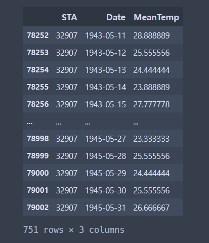
1943년 5월 11일부터 1945년 5월 31일까지 일단위 평균 온도이다.
중간에, Date 의 타입을 Object 타입에서 datetime 으로 바꾸어주었다.

이 데이터를 사용해서 시계열 그래프를 먼저 그려주자.
plt.figure(figsize = (22,8))
plt.plot(weather_bin.Date, weather_bin.MeanTemp)
plt.title("Mean Temperature of Bindukuri Area")
plt.xlabel("Date")
plt.ylabel("Mean Temperature")
plt.show()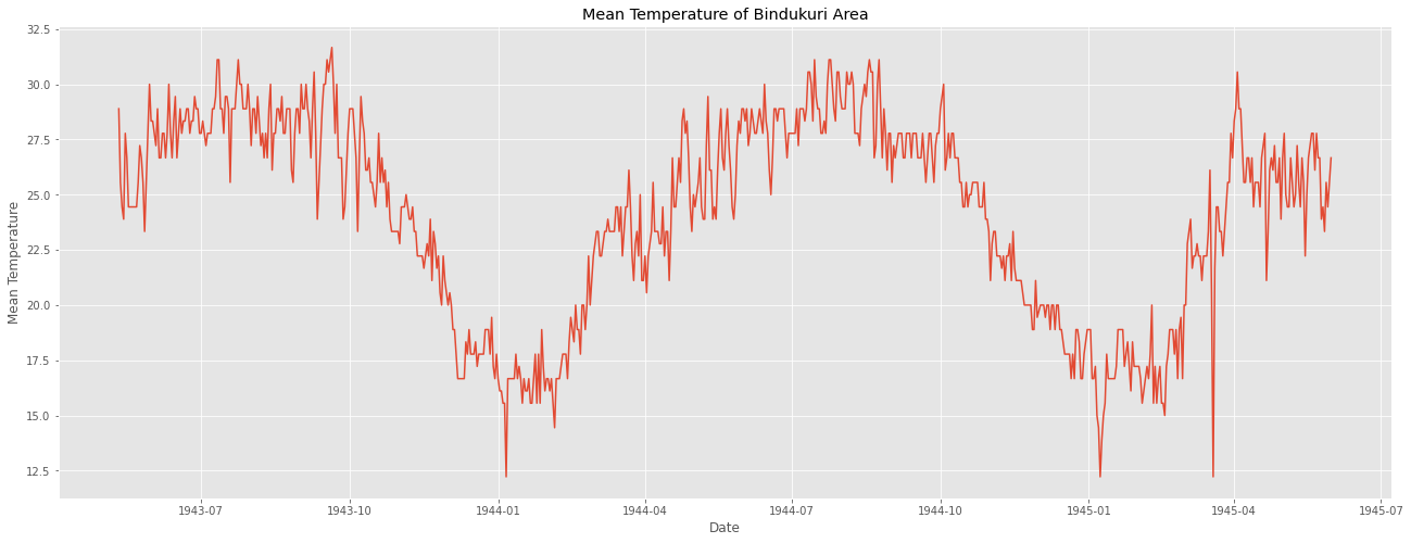
데이터가 계절적 변동을 가지고 있는 걸 확인했다.
이를 시계열 분해법으로 확인해보면 다음과 같다.
먼저, 시계열 형태의 ts데이터를 만들어준다.
timeSeries = weather_bin.loc[:, ["Date", "MeanTemp"]]
timeSeries.index = timeSeries.Date
ts = timeSeries.drop("Date", axis =1)
ts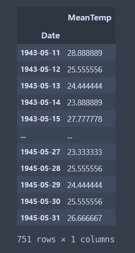
다음으로 seasonal_decompose() 를 이용해서 분해한다.
시계열 분해법으로 분해한 것이다. (이거 100살 먹었다던데)
from statsmodels.tsa.seasonal import seasonal_decompose
result = seasonal_decompose(ts["MeanTemp"], model = 'additive', period = 7)

fig = plt.figure()
fig = result.plot()
fig.set_size_inches(20,15)
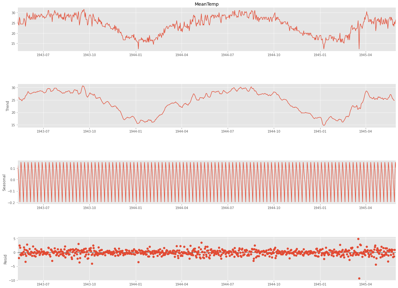
원래는 freq 였던 것 같은데 .. freq 하니까 자꾸 에러가 나더라.
그래서 period 로 바꾸어주었더니 잘 돌아갔음.
이게 아마 블로그의 freq 역할을 하는 게 아닐까 싶은 ..?
계절성 주기를 기반으로 값을 넣어주면 될 것 같다. 분기별은 4, 월별은 12, 주별 패턴이 있는 일별 데이터는 7로
초기 설정해보고 보면서 맞추는 것을 추천해주었다.
이 데이터는 계절성이 1년이기 때문에 365로 설정하는 것이 바람직하다고 한다.
여기서 데이터가 패턴을 갖고 있는 것으로 보이기 때문에 정상성이 의심된다.
이를 판단하기 위한 ACF 그래프를 그려보자.
ACF 는 자기상관함수였다.
시차에 따른 일련의 자기상관을 의미하며 시차가 커질수록 ACF 는 0에 근접하게 된다.
import statsmodels.api as sm

fig = plt.figure(figsize = (20,8))
ax1 = fig.add_subplot(211)
fig = sm.graphics.tsa.plot_acf(ts, lags=20, ax=ax1)
값이 아주아주 천천히 작아진다.
정상성을 만족하지 못한다는 뜻이다.
이번에는 statsmodel 의 adfuller를 사용하여
단위근 검정인 ADF 검정 (Augmented Dickey-Fuller Test) 를 진행해보자.
귀무가설 : 정상성을 만족하지 못한다.
대립가설 : 정상성을 만족한다.
의 가설을 세운다.
from statsmodels.tsa.stattools import adfuller
result = adfuller(ts)
print("ADF Statistic : %f" % result[0])
print('p-value : %f' % result[1])
print('Critical Values : ')
for key, value in result[4].items() :
    print('\t%s : %.3f' % (key,value))
p-value 를 확인했을 때, 0.05보다 훨씬 크므로, 귀무가설 채택역에 해당한다.
그러므로, ts 는 정상성을 만족하지 못한다.
정상성을 만족하기 위해서 1차 차분을 해보자.
# 이를 해결하기 위한 1차차분 진행
ts_diff = ts - ts.shift()
plt.figure(figsize = (22,8))
plt.plot(ts_diff)
plt.title("Differencing method")
plt.xlabel("Date")
plt.ylabel("Differencing Mean Temperature")
plt.show()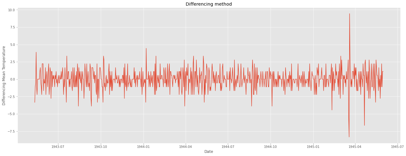
일정한 패턴이 보이지 않고 정상성을 만족하는 듯해 보인다.
ADF 검정을 다시 시행해주자.
result = adfuller(ts_diff[1:])
print("ADF Statistic : %f" % result[0])
print("p-value : %f" % result[1])
print("Critical Values : ")
for key, value in result[4].items():
    print('\t%s : %.3f' % (key,value))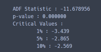
p-value 가 0.05보다 작으므로 귀무가설을 기각한다.
ts_diff , 1차 차분해준 데이터는 정상성을 만족한다.
이 차분한 데이터로 ACF와 PACF 그래프를 그려서 ARIMA 모형의 p 와 q 를 결정한다.
ACF 는 자기상관함수였고,
PACF 는 편자기상관함수였다.

한 번 더 확인하기.
우리는 아무튼 여기서 두 그래프가 모두 0에 금방 접근하는 것을 확인해서
p값과 q값을 구하면 된다.
import statsmodels.api as sm

fig = plt.figure(figsize = (20,8))
ax1 = fig.add_subplot(211)
fig = sm.graphics.tsa.plot_acf(ts_diff[1:], lags=20, ax=ax1)
#
ax2 = fig.add_subplot(212)
fig = sm.graphics.tsa.plot_pacf(ts_diff[1:], lags=20, ax=ax2)
sm.graphics.tsa.plot_acf 와 sm.graphics.tsa.plot_pacf 를 사용했다.
두 개 다 금방 0에 수렴하는 것을 확인했다.
그리고 2번째 lag 이후에 0에 수렴한다.
즉 , ARIMA(2,1,2) 모형을 base model로,
ARIMA(2,1,1), ARIMA(1,1,2), ARIMA(1,1,1) 등의 모델을 시도해볼 수 있다.
ARIMA (2,1,2) 모형으로 확인해보자.
import statsmodels.api as sm
from pandas import datetime
from statsmodels.tsa.arima.model import ARIMA

# fit model
model = ARIMA(ts, order=(2,1,2))
model_fit = model.fit()

# predict
start_index = datetime(1944, 6, 25)
end_index = datetime(1945, 5, 31)
forecast = model_fit.predict(start = start_index, end = end_index, typ ='levels')

# visualization
plt.figure(figsize = (22,8))
plt.plot(weather_bin.Date, weather_bin.MeanTemp, label = "original")
plt.plot(forecast, label = "predicted")
plt.title("Time Series Forecast")
plt.xlabel("Date")
plt.ylabel("Mean Temperature")
plt.legend()
plt.show()
1944년 6월 25일 부터를 Test 했다.
여기서 predict 를 할 때 typ 를 levels 로 맞추어 주어야 한다고 한다.
차분이 들어간 모델의 경우 typ 의 default 값인 linear 로 설정한 경우 차분한 값에 대한 데이터가 나오기 때문이다.

눈으로 봤을 때는 결과가 잘 나온것 같다...
진짜 잘 나온 것 같다
그렇다면 모든 경로를 시각화하고 예측해서 평균제곱오차(mse(Mean squared Error)를 찾아보자.
from sklearn.metrics import mean_squared_error

# fit model
forecast2 = model_fit.predict()
error = mean_squared_error(ts, forecast2)
print("error: " ,error)

# visualization
plt.figure(figsize=(22,10))
plt.plot(weather_bin.Date,weather_bin.MeanTemp,label = "original")
plt.plot(forecast2,label = "predicted")
plt.title("Time Series Forecast")
plt.xlabel("Date")
plt.ylabel("Mean Temperature")
plt.legend()
plt.savefig('graph.png')

plt.show()
error: 2.841395328567663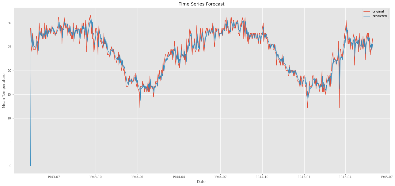
와웅 ㅋ
오차가 거의 없다 !
잔차 분석을 또 해보자.
잔차는 어떠한 패턴이나 특징이 나타나서는 안 된다.
resi = np.array(weather_bin[weather_bin.Date>=start_index].MeanTemp) - np.array(forecast)

plt.figure(figsize = (22,8))
plt.plot(weather_bin.Date[weather_bin.Date>=start_index],resi)

plt.xlabel("Date")
plt.ylabel("Residual")
plt.legend()
plt.show()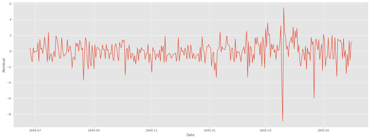
굳ㅋ
정상성도 한 번 파악해주자.
ACF 그래프를 사용해보자.
# ACF 검정
fig = plt.figure(figsize = (20,10))
ax1 = fig.add_subplot(211)
fig = sm.graphics.tsa.plot_acf(resi, lags=20, ax=ax1)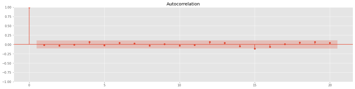
ADF 검정도 해주자.
result = adfuller(resi)
print("ADF Statistic : %f" % result [0])
print("p-value : %f" % result[1])
print("Critical Values : ")
for key, value in result[4].items() :
    print("\t%s : %.3f" % (key, value))
p-value 가 0.05 보다 작으므로 정상성을 만족한다는 결과가 나온다.
마지막으로 성능 확인.
from sklearn import metrics

def scoring(y_true , y_pred) :
    r2 = round(metrics.r2_score(y_true, y_pred) * 100, 3)
    corr = round(np.corrcoef(y_true, y_pred)[0,1], 3)
    mape = round(metrics.mean_absolute_percentage_error(y_true, y_pred) * 100, 3)
    rmse = round(metrics.mean_squared_error(y_true, y_pred, squared= False), 3)


    df = pd.DataFrame({
            "R2" : r2,
            "Corr" : corr,
            "RMSE" : rmse,
            "MAPE" : mape
    }, index = [0])

    return df
오만 걸로 성능을 다 확인해봤다.
참조
[Python] 날씨 시계열 데이터(Kaggle)로 ARIMA 적용하기
2021.05.24 - [통계 지식/시계열자료 분석] - 시계열 분해란?(Time Series Decomposition) :: 시계열 분석이란? 시계열 데이터란? 추세(Trend), 순환(Cycle), 계절성(Seasonal), 불규칙 요소(Random, Residual) 시..
leedakyeong.tistory.com
+
https://totoma3.github.io/kaggle/%EC%BA%90%EA%B8%80-Time-Series-Prediction-Tutorial-with-EDA/
2차세계대전 데이터와 기온 데이터를 이용한 시계열 분석
캐글의 노트북 리뷰!
totoma3.github.io
블로그 참고해서 그대로 따라했다..
왜냐하면 나는 잘 모르기 때문 ..ㅠㅠ
이해가.. 너무 어렵다 ...


